 Marketing 360º
Improve your email marketing through effective CTAs
CTA tips to improve your email marketing campaign
It’s no secret that creating an email marketing campaign seeks to achieve specific goals that benefit your brand or company in one way or another. And to achieve these goals, calls to action (CTAs) are essential.
CTAs eye-catching buttons or hyperlinks that aim to encourage and direct users to carry out a certain action that you want them to do. It could be that you want them to visit your online shop, or sign up for your next webinar or new product. There are thousands of options.
More specifically, within email marketing, CTAs are going to push users to the next level and do more than just simply opening the email and not send it to junk mail.

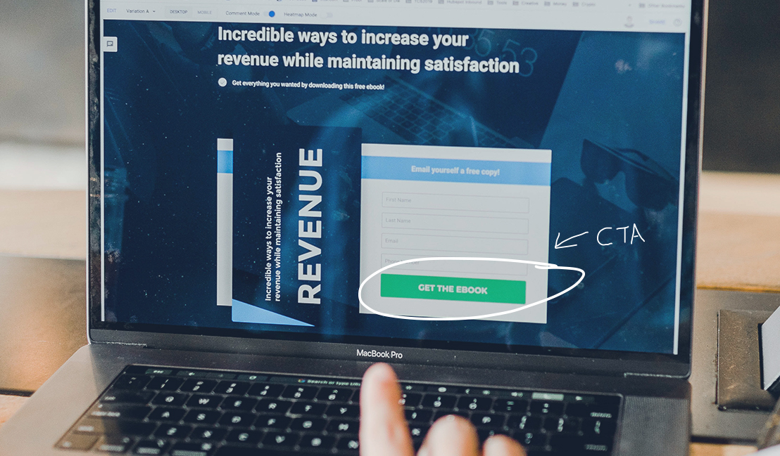
Caption: The importance of an eye-catching CTA
But… a call to action doesn’t work all on its own
It’s important to keep in mind that getting users to open one of the thousands of emails they get in their inbox before deleting them or marking it as spam is not an easy feat.
So, you need to make sure that every element of your email is part of the CTA. Everything from the subject line to the last word needs to grab the attention of internauts and never let go before the definitive call to action.
It would be pointless to spend so much time and effort in creating functional CTAs for your email marketing campaigns, if nobody clicks on them.
How to make CTAs that will really improve your email marketing campaigns?
1. The first thing is to outline the purpose of the call to action. In other words, you should establish the exact action that you want users to carry out.
Whether it’s downloading an ebook, visiting your website, signing up to your landing page, buying from your online shop, the possibilities are endless, as we said before.
Remember that you can place several CTA throughout the email, but ALL of them have to have the same goal.
2. Once you know the role your CTA plays in the campaign, you should write a text explaining what happens when clicking on it.
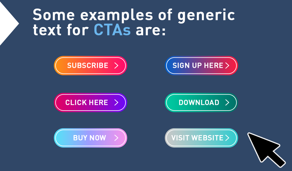
But be careful, don’t use generic text, the internet is so full of that it will just go unnoticed. Remember your main goal is to catch the attention of the reader and keep it there.
Imagine receiving two emails from two different sports shops, both offering you their products. At the bottom you come across a call to action that says “buy now” and the other says “change my lifestyle”. Which one would you go for? Do you now understand what we mean?

Caption: Examples of generic text for CTAs
One extra tip: if you’re going to place several CTAs in an email, you can use different copy or orginal texts for each one. Just remember that each one should invite the reader to carry out the same action. Several CTAs = same end goal.
3. Next, focus on the design of the CTA. When it comes it size, you should find one that fits the content in your mail. Strike a balance so that your reader can look at everything without getting overwhelmed.
For example, if you are also using text and images, you have to find the right size and format so that all the elements work together as a whole while they still work on their own too.
If your email has a lot of text, the buttons are sure to work fine. However, if you used more images, you can test out the hyperlinks. The idea is to not overwhelm the reader.
As for colour, after having dealt with the size, whether it’s a button or a link, then you can use a colour that contrasts with everything else so that the CTA stands out.
4. Now is the time to place your CTA. The best place to put it is after any other element that provides the reader with information about what they will get. It sounds quite logical if you put yourself in the user’s shoes. You don’t click on every button or link the Internet shows you, do you? First, you look at what’s there and if it convinces you, you click on it!
If your product or service doesn’t need much information around it, you can place your CTA at the beginning, after a simple image explaining what you’re offering.
On the other hand, if your product or service requires considerable investment or effort on the clinet’s part, it’s best to include a convincing, detailed text explaining what you offer so that when the client is finished reading, they take the desired action.
5. All that’s left is to test again and again. You can use tools like A/B testing to carry out real tests to find what works and what doesn’t work. Experiment with different sizes of CTA, colours and placements.
You’ll see that by following these tips, call to action will become an all important tool in your toolbox for your email marketing campaigns.
Lastly, we’ll use a CTA to end our post… if this post was helpful for you, share it with your marketing friends! They will be sure to thank you!


